ASPCA Helps: Case study
Website Design
Figma/Photoshop
Project Overview
The Product:
This project focused on building a website that helps communities track stray animals in real time. The goal was to create a platform where people can report sightings, shelters can monitor cases, and volunteers can coordinate rescues more effectively.
Project Duration:
February 2025–August 2025.
The Problem:
Communities often lack a centralized platform to report and track stray animals.
Reports are scattered across social media, flyers, or word of mouth, leading to missed opportunities for rescue.
Animal shelters face difficulties with limited resources and outdated reporting methods.
The Goal:
Develop a website that enables easy reporting of stray animal sightings with photos, descriptions, and locations.
Provide real-time tracking and mapping of reported animals.
Create tools for shelters and volunteers to coordinate rescues and reduce duplication of effort.
My Role:
UX/UI Designer
Responsibilities:
User research
Brainstorming
Wireframing
Prototyping
Testing
Understanding The User
User Research: Summary
Have you ever thought of what you’d do if you come across a stray animal? Maybe you have already came across one and not known what do to? There aren’t many sources for situations like this, therefore there aren’t many outlets to address the users needs. Users need to be able to find a website that can help them find sources and is easy to use so that they can find a good and safe place to help the animals.
User Research: Pain Points
No Sources
There is not a clear source for helping stray animals, there needs to be a source in the user’s area.
No-Kill Shelters
Some users feel very strongly about no-kill shelters, so all of the sources on the site will be vetted to make sure that they are all no-kill shelters, so users can be confident the animal is going to a good place.
Animal Selections
There are many different animals that can be injured. The site needs to make sure that the user can choose the correct animal to make sure the source is accurate..
Persona: Katelyn Park
Problem statement:
Katelyn is a person that wants to save local animals, which will affect the community and the animal population by giving the animals a home or stunting their reproduction to help control the pet population. We will measure effectiveness by the amount of animals that are affected by local shelters.


User journey map
Goal:
Katelyn want to help local stray cats find a new home.
Starting the site design
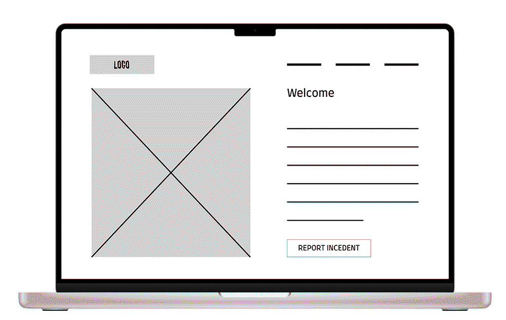
Paper wireframes
We wanted to create an easy but interacting design that engaged the user and created a flow that was easy to get the help that the user needs. We wanted the site to have some features that made it easy to find the correct sources!


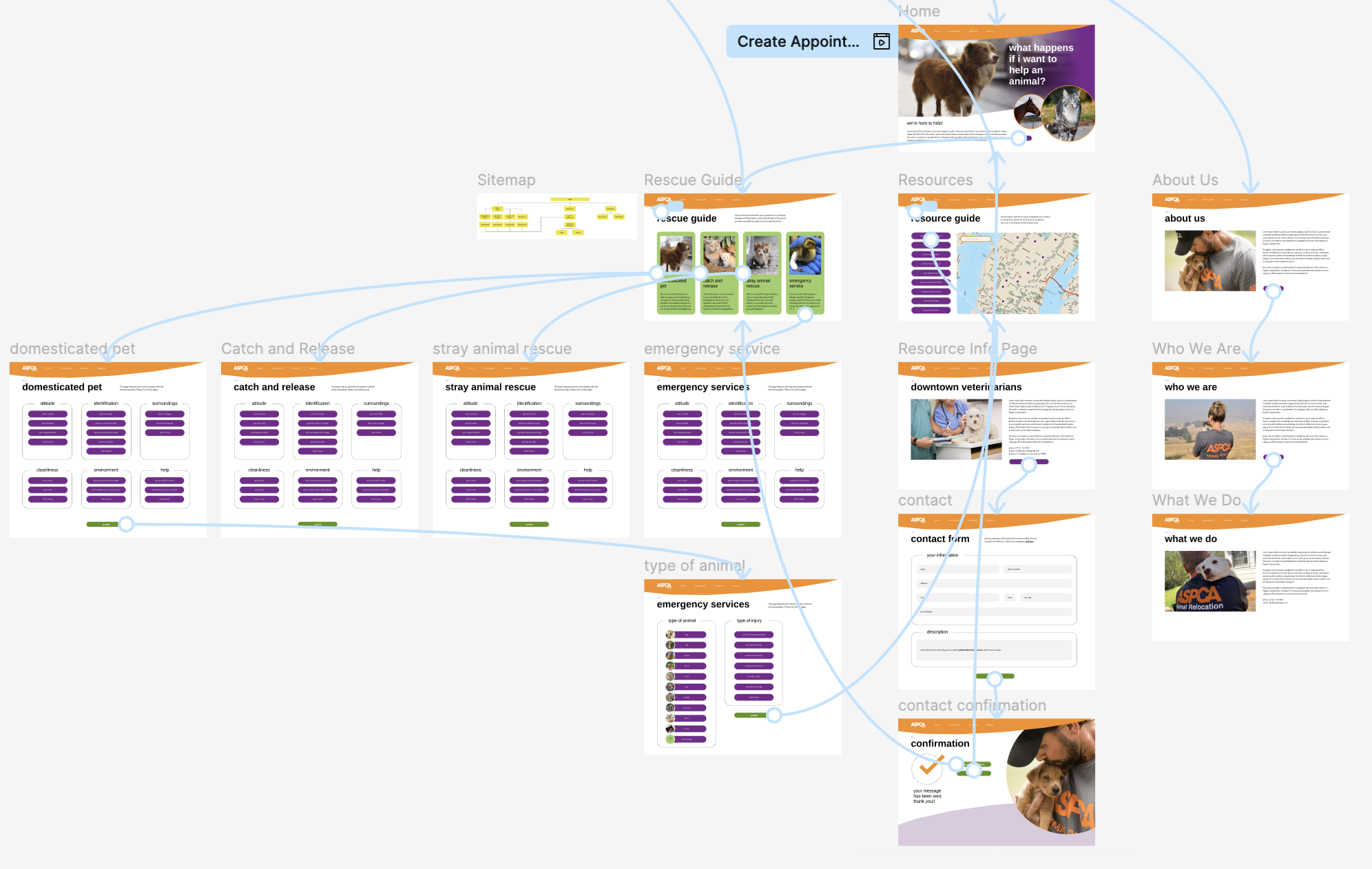
Site Map
The site map helped to design the web version of the app. It broke down all of the links that we had planned and made sure that the navigation was as easy and straight-forward as the app is.

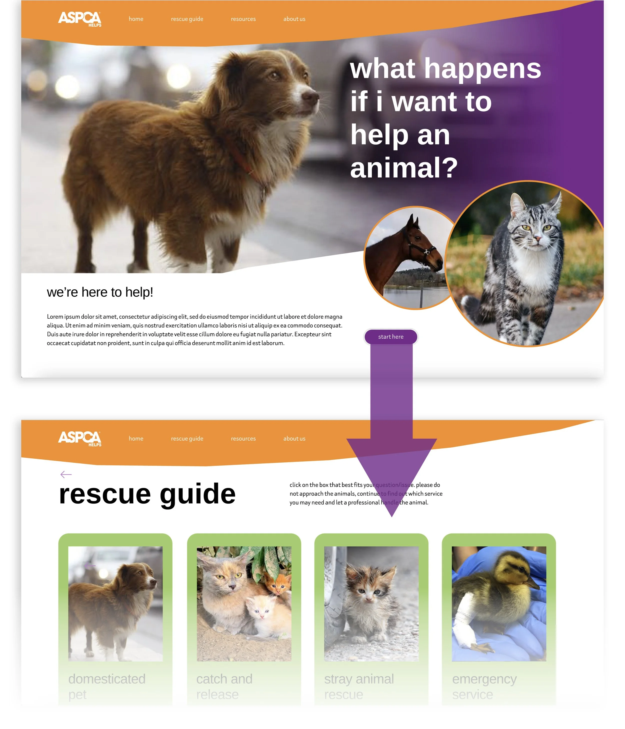
Digital wireframes
We want the home screen to present some options that will capture the user’s attention. Simplicity is the goal here and we needed to make sure that all users could help animals in need.


Low Fidelity Prototype
We want the user flow to be easy and straightforward. The design allows the users to easily find the items that they’re looking for, add them to the bag and checkout quickly.
You can view the prototype here.
Usability study: findings
We analyzed the data that we got from our focus group and needed to put it in order so we know what is working what needs to be addressed.
Round 1 findings
The place to “report an incident” was difficult to find for some users.
Some participants didn’t understand the option to choose “help a stray”.
Most users need more explanation on what the map is for.
Round 2 findings
“Report an incident” was moved so that it was easier to find.
“Help a stray” was made more clear, so users know exactly what it’s for.
The map was made clearer and more options were given.
Refining the design
The design system
The design system consisted many different colors, to best represent the ASPCA® branding. All the colors have their place and represent the different aspects of the branding and message that ASPCA® is putting out to the world.

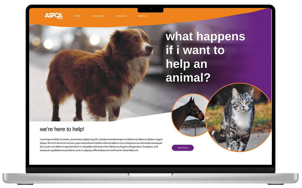
Mockups


Accessibility considerations
The main colors of the branding are purple, orange and green. The green may be an issue for some users that are color blind.
We used the colors in a way that they would be high contrast with the text in a different color to ensure legibility..
This was tested by some users who had trouble telling red and green colors and it was successful!! The high contrast design allowed for differentiation of colors.